lume
A smart journaling app that transforms daily context—like calendar events, weather, and app usage—into meaningful insights, helping users understand themselves better and live more intentionally.
Duration
Jan 2025 - April 2025
8 weeks
Role
Product Designer
end-to-end
Team
Independent Project
UX Design Diploma Capstone
Platform
iOS
mobile
The Problem
Mental health and work-life balance have become central concerns for Millennials and Gen Z, yet much of the advice circulating today feels generic or overly prescriptive.
Self-reflection is one of the most powerful and personal tools we have—but it’s not always easy to practice consistently.
I wanted to create a more introspective, low-effort way to help people notice patterns, check in with themselves, and feel more grounded in their everyday lives.
Primary Research
To better understand how people approach self-reflection and what might support or prevent it, I conducted primary research through one-on-one interviews.
Methodology
User Interviews
Number of Participants
5
Demographic
Ages 23 to 40
Key Insights
Reflection is seen as valuable
While many recognise the value of reflection it's often hard to prioritise within busy schedules.
Reflection is often reactive and negative
Most people only reflect when something feels wrong or overwhelming. Reflection tends to happen in moments of crisis, rather than as a consistent habit.
Most people want guidance
While a few interviewees felt confident reflecting on their own, the majority said they didn’t know how to begin or wished for more structure.
Journaling often becomes event-tracking
Several participants shared that their journaling ends up as a record of what happened, rather than a tool for insight.
These conversations made it clear that for reflection to be sustainable, it needs to be mentally lightweight—easy to start, quick to complete, and focused solely on self-awareness.
I also realized that while most people benefit from guidance, that guidance must feel personal and adaptable, not one-size-fits-all. This insight led me to the guiding question of:
"How might we guide busy Gen Z and millennial professionals through self-reflection in an effortless and personal way, enabling them to make intentional changes that improve their well-being?"
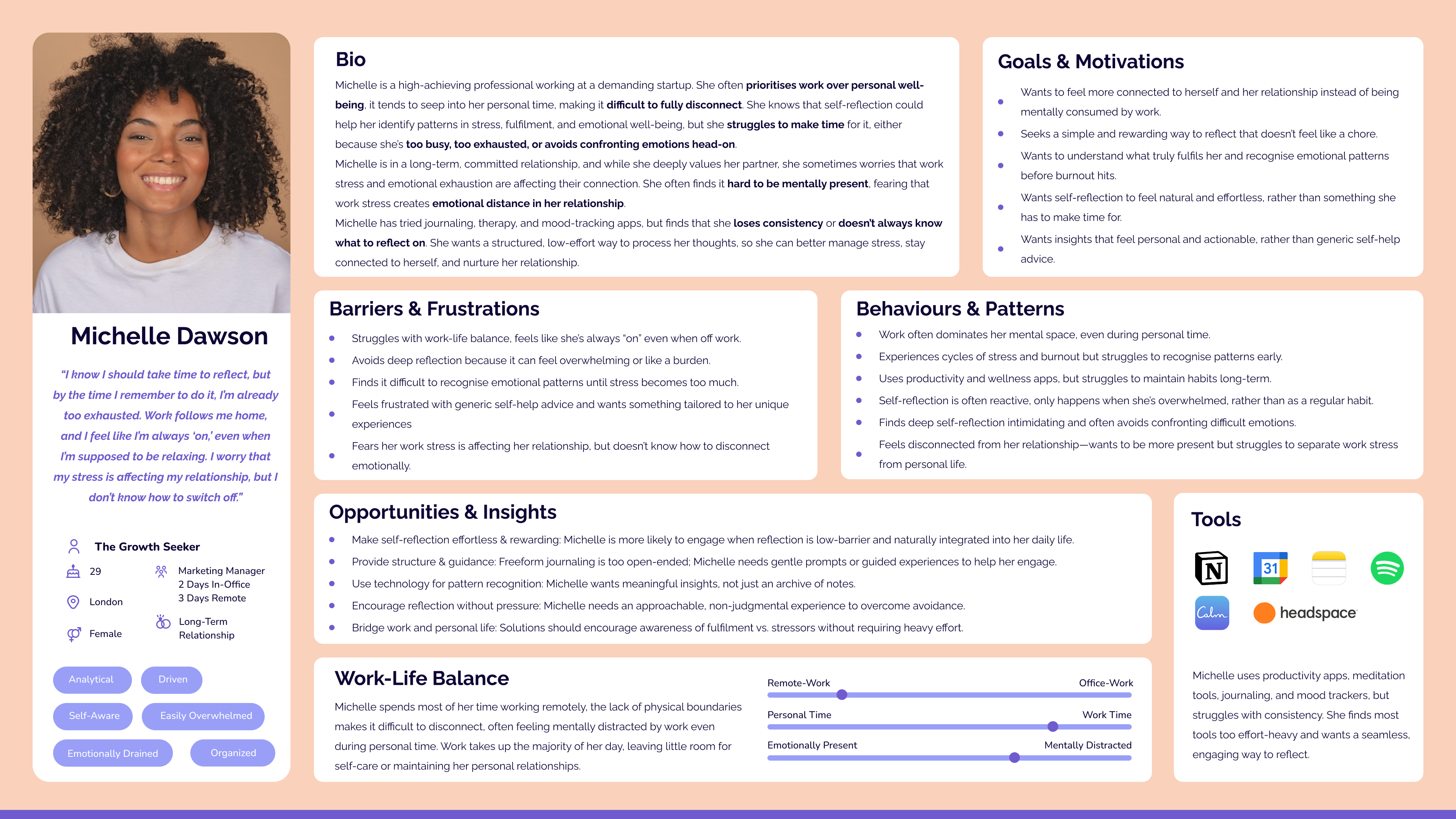
Persona
To guide design decisions, I created a user persona that reflects common patterns from my research: busy, high-achieving individuals who value emotional well-being but struggle to make time for reflection.
Competitive Analysis
I analysed several existing journaling and reflection tools to identify common gaps, usability patterns, and opportunities for differentiation.
Honestly
+ Great AI features
– Extracted details can feel inaccurate
stoic.
+ Feature rich
– All the options can feel overwhelming
Daylio
+ Great detailed analytics
– Entry method can be overwhelming
5 Minute Journal
+ Clean and simple
– Not very customisable
While each app had strengths, I noticed a consistent gap: tools were either too rigid or too complex. Many users want thoughtful guidance, but not at the cost of simplicity or personalization. This analysis helped me define the solution: a journaling experience that is emotionally supportive, low-effort, and smart enough to adapt to individual needs.
Key Oppourtunity
While reviewing competitors and analysing user interviews, one insight stood out:
Journaling often becomes event-tracking
Several participants shared that their journaling ends up as a record of what happened, rather than a tool for insight.
None of the journaling apps I explored addressed this—despite it being one of the most mentally demanding parts of the process. This felt like a missed opportunity to better support users.
I began exploring how passive data—like location, weather, screen time, and calendar events—could be used to gently support reflection. By surfacing helpful context, the app could ease the mental effort of recalling the day, making journaling feel more intuitive, effortless, and rewarding.
Ideation
Based on my research, I came up with a list of epics and user stories for each that I felt would make the solution useful in addressing the core needs of users. The following three epics were identified as the most crucial components that would deliver value to users:
Self-Reflection & Journaling
Defines the journaling and reflection in the app, such as customisable prompts, journaling modes, and the features around the summary exctracted from phone data.
Gaining Insights
Describes how insights and suggestions are derived from personal data, providing users with meaningful, actionable feedback to guide their self-improvement.
Habit Building
Describes how the app supports users in creating and maintaining a consistent journaling habit through customizable reminders, tracking, and positive reinforcement.
I decided to focus on the first epic as it serves as the foundation of the entire application. Daily journaling is essential for generating insights, and building the journaling habit is key. Therefore, the primary task I focused on was optimizing the core task flow of daily journaling

With a clearer direction in mind, I began sketching early concepts. These low-fidelity wireframes helped me think through layout, flow, and how passive data could be introduced in a lightweight and supportive way.

A distraction-free journal start page designed to feel welcoming.

A “Today’s Summary” page that removes the need to recall events, making reflection easier.

Lightweight interaction patterns for selecting moods and influences
Wireframing
I created a mid-fidelity prototype to map out the full journaling flow—from the Today Summary to the final reflection prompt. The goal was to test structure, clarity, and emotional tone early, before moving into high-fidelity design.
I conducted two rounds of usability testing, with five participants each round and iterated on the wireframe each time.
Key Changes:
Renamed navigation items and screen titles to reduce ambiguity
Reorganised visual hierarchy so users could better predict what actions each element triggered
Added more interaction to the summary screen to show it was a collage of contextual items, not just a static screen
Branding
To shape the emotional tone of the product, I started by defining five key brand adjectives:
Serene
Reflective
Elegant
Illuminating
Contemplative
These qualities guided every decision—from naming to visuals.
I explored several naming directions before landing on lume, short for “illuminate.” It evokes the idea of an internal guiding light—something personal, grounding, and gently revealing.
With the name in place, I developed a moodboard, colour palette, and wordmark that aligned with lume’s tone.
Moodboard

Wordmark

Primary Brand Colours
UI Library
To keep the interface consistent and scalable, I created a structured UI library built on foundational design principles. This included defined foundations such as typography, color, and grid, followed by components organized into atoms, molecules, organisms, and templates.
Colours were defined semantically—using labels like “Background” or “Active Elements”—to support both light and dark modes without changing the system’s logic. This approach made it easier to maintain consistency across themes and streamline the design process.
High-Fidelity Prototype
With the brand’s tone established, I translated the wireframe prototype to high-fidelity prototype. The design was made to be intuitive while evoking a calm, introspective atmosphere for users to reflect on their day.
Dark mode was chosen as the primary visual theme based on user research. Most participants said they preferred to journal at night, often in bed. To support that habit, I designed an interface that feels soft on the eyes and calming in low-light environments. Beyond accessibility, dark mode also reinforces the app’s introspective and quiet tone. Light mode provides an alternative for daytime use, offering flexibility for users based on their environment and preferences and can be toggled in the app’s profile settings.
The high-fidelity prototype brings these design elements together—both dark and light modes, intuitive navigation, and an emotionally resonant interface. It’s designed to be simple, clear, and user-friendly, supporting an enjoyable journaling experience.
Marketing Site
I designed a one-page marketing site in Figma to explore how the product could be introduced to potential users. The focus was on maintaining the same calm, introspective tone while clearly communicating its purpose and value. I also used this as an opportunity to design for multiple devices and practice creating responsive layouts with the target audience in mind.


Final Thoughts
Key Learnings
This was my first time designing a product end to end, and I learned something at every stage—from conducting research and synthesising qualitative feedback to creating flows, testing assumptions, and building a UI system from scratch.
Challenges
Coming from a front-end engineering background, I was used to working within existing design systems—so suddenly having full creative freedom felt exciting but also overwhelming. Without a formal design background, I found color and stylistic choices especially challenging.
To stay grounded, I relied on user needs to guide functional decisions and used a moodboard to help define the visual tone. While I still find some of these aspects difficult, the process taught me how to lean on structure, intention, and external references to make creative decisions with more confidence.
Highlights
One of the highlights for me was user testing. I found it not only fun but incredibly valuable—seeing people interact with the product in real time gave me a new perspective on how ideas translate beyond the screen. It also taught me how to synthesize feedback: balancing strong opinions with patterns across multiple users to make thoughtful design decisions.
Building the UI system was another part I really enjoyed. I’ve always loved working with design systems, so getting the chance to build one myself was deeply satisfying. There’s something motivating about knowing that if the foundation is done right, the product will be easier to scale and more consistent long-term.
Next Steps
If I were to continue working on this application, I’d love to do more testing and gradually expand it. I had a broader roadmap in mind, including prompt customisation and habit building, but for this project I focused on one main flow—however there’s a lot more I’d be excited to bring to life.