RevCap
Revolut
A monthly spending recap feature that helps users reflect on their financial habits.
Duration
March 2025
24 hours
Role
UX/UI Designer
Team
Team of 5
1 Data Scientist, 1 Software Engineer, 3 Designers
Platform
iOS
mobile
The Challenge
Context
Revolut was the industry partner for BrainStation’s 24-hour industry project. We worked as a cross-functional team of three UX designers, a software engineer, and a data scientist. Our goal was to rapidly explore, prototype, and present a solution to them within the tight timeframe.
Revolut is a British multinational neobank and fintech company that offers banking services for over 50 million customers, including individuals and businesses. Their “global mission is for every person and business to do all things money — spending, saving, investing, borrowing, managing, and more— in just a few taps.”
The Problem Space
Despite the proliferation of financial tools and platforms, research shows that customers are more vulnerable than ever. It is in the best interests of banks to nurture financial literacy and improve access to finance education for consumers, encouraging customers to engage in practices that improve their financial and overall well being.
Design Challenge
We were given the following How Might We statement:
“How might we help users gain a clear and intuitive understanding of their spending habits, identifying areas for potential improvement without overwhelming them with data?”
Secondary Research
With only 24 hours, alignment and collaboration were crucial. As designers, we made a conscious effort to involve our entire cross-functional team—including our developer and data scientist—throughout the process. Our goal was to ensure the solution wasn’t just user-centred and intuitive, but also technically feasible and supported by real data.
To ensure our design was grounded in real user needs, we conducted secondary research into financial literacy trends, user behaviour, and barriers to engagement with spending data. A key insight stood out:
Gen Z is the least financially literate earning generation, even though many of them are beginning to make their own income.
Gen Z struggles with understanding where their money goes and managing their finances. However, they are also extremely tech-savvy and open to using digital tools for learning and self-improvement. This presented a great opportunity to help Gen Z understand their spending and gain financial literacy through a digital solution.
Based on this key insight we decided to target the Gen Z demographic.
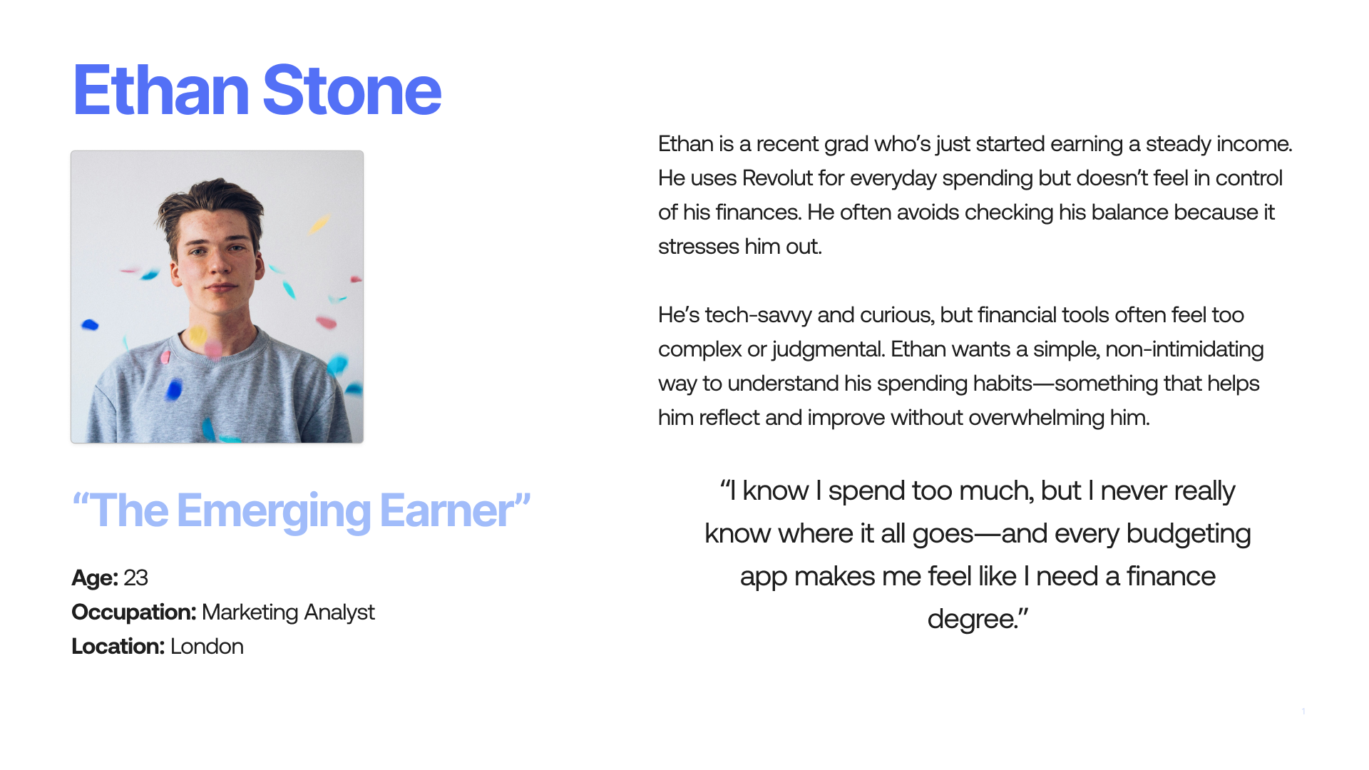
Proto-Persona
To guide our design decisions, we created a proto-persona that represented our core user segment: Gen Z professionals who are just beginning their financial journey. We focused on users who are digitally fluent and eager to improve their financial habits, but often feel overwhelmed by complex tools and data-heavy interfaces.
Proto-Persona Snapshot
Existing Solutions Within Revolut
To ground our solution in Revolut’s current ecosystem, we began by exploring the app’s existing features related to spending management. We identified two core tools:
Spending Tracking
+Users can view detailed breakdowns of their spending through visualizations and categories.
– Can be hard to digest or feel actionable, especially for users like Ethan, who are just beginning to engage with financial habits.
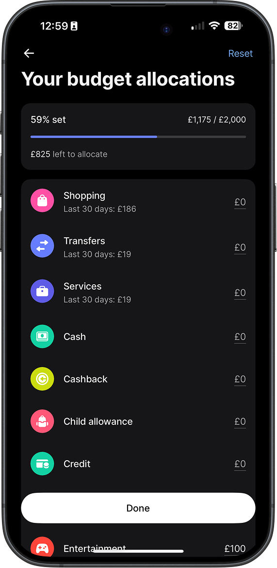
Spending Budgets
+ Users can set an overall monthly budget, as well as individual limits for different categories like food, travel, or shopping.
– Users have to create their budget manually which can be tedious.
– Beginners to personal finance, like Ethan, may struggle to determine what constitutes a useful or reasonable budget to set.
There was an opportunity to bridge the gap between raw data and meaningful insight, by designing a feature that felt more digestible, human, and reflective—helping users not just track their spending, but actually understand it and make informed choices about it.
Ideation
With limited time, we needed to generate a wide range of ideas quickly while keeping feasibility and user needs in mind. We kicked off the ideation process with a Crazy 8s session, where each team member—including our developer and data scientist—rapidly sketched 8 ideas in 8 minutes. This helped us prioritize creativity over perfection and ensured every perspective was included from the start.
We then shared and discussed our ideas, nominating the ones we found most compelling. From there, we narrowed down to four strong contenders and used dot voting (two votes per person) to select a clear winner:
A monthly spending recap within the Revolut app.
We sketched out initial screens together on a shared whiteboard, aligning the UX flow with what was technically feasible and data-supported.
The Solution - RevCap
Our final concept was RevCap, a monthly recap feature integrated into the Revolut app and delivers a clear and supportive overview of spending habits without overwhelming users with data. We named it RevCap—a blend of Revolut and recap—to reflect the nature of the feature while keeping it on-brand with existing elements like RevPoints.
With Gen Z in mind, we crafted RevCap to feel playful and engaging, using light, conversational copy and bite-sized insights to make financial reflection feel approachable and even fun.
Features
Spending Style
A friendly spending identity—like “Weekend Spender” or “Subscription Spender”—to help users recognize patterns and become more self-aware.
Personalised Saving Suggestion
Smart tips that highlight small, realistic ways to save based on user behaviour.
Micro Quiz
A lightweight multiple-choice question to help improve users’ financial literacy in a casual, bite-sized manner.
Generated Smart Budget
Rather than setting up a budget from scratch, users can opt into a realistic, personalised budget generated from their spending data, making it easy to get started with minimal effort while leveraging Revolut's existing budgeting feature
High-Fidelity Prototype
Final Thoughts
Working on RevCap during a 24-hour sprint showed us just how much is possible with strong cross-functional collaboration. Involving our developer and data scientist early in ideation and sketching helped us stay aligned on feasibility while still aiming for a playful, user-first experience.
We focused on making financial insights more intuitive and less overwhelming—especially for Gen Z users, who are beginning to manage their own finances and can often be overlooked in traditional financial tools. The challenge pushed us to consider not just what information to show, but how to communicate it in a way that feels approachable and engaging.
The fast-paced environment taught me that “done is often better than perfect.” With limited time, we had to prioritize delivering a complete concept over perfecting individual features. Although there were moments when we were tempted to spend extra time polishing screens and adding animations, we had to remind ourselves that the goal was to communicate our idea as effectively as possible to the judges by the end of the hackathon.
Presenting to members of Revolut was a highlight, and their feedback was encouraging and insightful. As a next step, we’d love to continue the conversation with their team and explore opportunities to test the concept with real users, refining the tone, usefulness, and impact of the feature.